|
Angular Gauge |
Top Previous Next |
|
Gauges are quite customizable and all sorts of gauges can be created. Many of the measurements used in customizing angular gauges is done in % units. This is percent of the maximum radius. The maximum radius is determined by the overall control size, changed like any other control by dragging the corners of the control. The maximum radius is simply 1/2 the minimum of the width and height of the control. By using percent, the proportions of the gauge will scale as the control is scaled. The exception to using percent is in line widths, which is specified in pixels, and font sizes. Main: Expression: the result determines the rotation of the pointer on the gauge. If the result is past the min/max of the gauge, it will simply be pegged. Min / Max: the minimum and maximum values displayed on the gauge. If the pointer expression goes past these limits, it will simply "peg" at the limit. Start Degrees: the angle where the minimum value will be displayed. 0 degrees is to the right of center, with positive degrees going clockwise around. Range Degrees: the total sweep angle of the gauge. This can be 360 degrees. It can be more than 360 degrees even, though labels will not display past 360 degrees. This can also be negative, which causes the gauge to go counterclockwise instead of clockwise. Style: with the exception of background color, this is for the text labels
Ticks: Major ticks are split around the range of the gauge and also determine where labels are displayed. Minor ticks are displayed between each major tick. Major Tick Count: the total number of ticks displayed. Note that since one is displayed at the beginning and end, you end up with 1 less area. So, for example, if your range is 0 to 10 and you want to display a tick every 1 unit, you would specify 11 ticks. If your range is >= 360 or <= -360 than any labels at or past the 360 mark are not displayed. Minor Tick Count: the number of ticks displayed between each major tick. Position: how far from the center the tick is displayed Labels: A label is placed for every major tick if shown. Position determines how far from the center the label is displayed. Note that unlike all the other elements of the gauge which are cropped to the overall size of the control, labels can appear outside the control's boundaries. Area Colors: Area colors determine the background color of the gauge area between the inner and outer arcs. You can have varying colors depicting certain ranges of values. You can have as many areas as you need, but each area should end at a value greater than the previous value. Up to: since area color sizes are determined by an expression, you can actually make the area color change size based on a tag or other variable. Do not use a pointer (by leaving its expression blank) and this might make an interesting gauge type. Property names for script access (intermediate): you can access the properties of this control as described in the script section. Here are the properties for this control: pointers.0.expression: a string containing the expression for the pointer showMajor showMinor showLabels Area Colors: "bkColors" is a property that contains an array. If you want to add new colors programmatically, you will have to retrieve the bkColors property, then add to it manually, then set the property with the result. Otherwise, like series in trend graphs, you can access an already created color by specifying the index, starting with 0. So for the first color, it would be bkColors.0.: bkColors.0.color
|
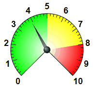
 An angular gauge is like the speedometer on a car. It displays a value by rotating a pointer around a central axis: